Have you ever stared at a heavy data sheet document until your eyes crossed? Working with large volumes of data can be extremely taxing. That’s where pivot tables come in. Pivot tables are an easy way to show aggregated data from a bloated spreadsheet. So can you put a pivot table in Google Sheets? Fortunately, you can, and in this pivot table Google Sheets guide, we will go through how to make them and why they’re useful.
The concept of pivot tables in Google Sheets may seem confusing at first, but once you get the hang of it, you’ll find your data analysis skills rise to a different level. This tutorial is aimed at introducing Google Sheet pivot tables and their use to beginners and helping intermediate-level users up their pivot table skills with some additional tips and tricks.
Whether you’re an experienced Excel user and wondering “Are there pivot tables in Google Sheets?” or are a new user and wondering how they work, we have you covered. Read on to learn how to do a pivot table in Google Sheets.
Table of Contents
What Is a Google Sheet Pivot Table?
Pivot tables are tables composed of columns and rows that can be moved around (pivoted), allowing you to group rows and columns, isolate, expand and aggregate your data in various ways, and in real-time.
If that sounded complex, let’s break it down with an example.
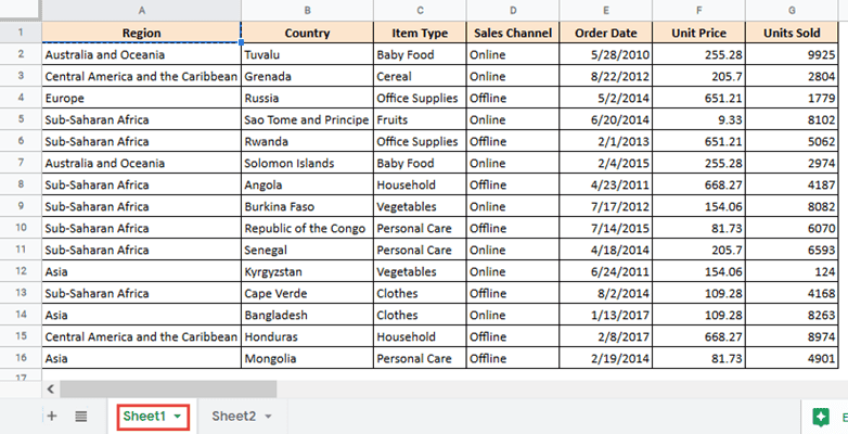
Take a look at the data set below:
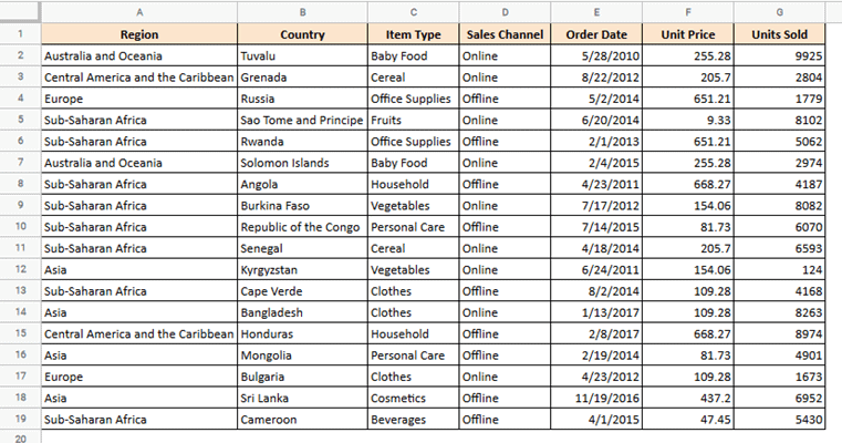
The above dataset is large, looks complex, and it’s quite hard to make any sort of inference from it. A pivot table could help you condense a data set like this to get a better view and understanding of relationships in the data.
Why Do I Need a Pivot Table?
So, what are pivot tables used for? Pivot tables help you analyze your data through various angles, giving you deeper insights into relationships between elements of your data. They help you form aggregated data by combining and summarizing information from the large amount of data that you have.
For example, a pivot table could help you answer questions like:
- How many countries are there from each region?
- What is the average number of units sold for each item type?
- Which region made the most sales?
- Which items were sold the least?
- How many orders were made for baby food?
- Which types of items were sold more online?
- What is the number of item types sold by each region?
- What is the total number of units sold for each item type?
- How did sales change before and after a given date?
As you can see, asking these questions lets you understand your data better and helps you make more informed decisions. Pivot tables can organize your data such that you can easily get answers to questions like these.
The Benefits of Using a Pivot Table
At this point, you might be thinking, ‘Why not just use formulas to answer these questions?’. The answer is that pivot tables get your information extracted much faster than formulas. Since they are flexible (and ‘pivot’-able), they let you turn your data around to quickly and easily get your answers. Moreover, pivot tables reduce the chances of human error, giving you more accurate information.
There are several other reasons to use pivot tables, here are a few:
- Easy to create and can be made quickly
- Instant data creation
- Summarizes large sets of data
- Help recognize data patterns
How to Make a Pivot Table in Google Sheets
Now that you understand the basic idea behind pivot tables, let us see how you can create one. The best way to understand the process is by example. We are going to use the following data sample (which you can download from this link), and create various pivot tables from it to answer some of our questions.
To create a pivot table from the above data, follow the steps shown below:
Step 1: Select all the data in your spreadsheet (on which you want to base your pivot table). Make sure to include your headers.
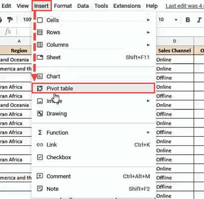
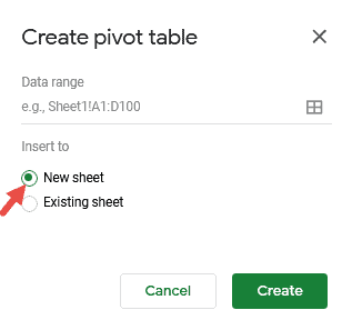
Step 2: From the Insert menu, select Pivot table.
Step 3: In the ‘Create pivot table’ box, if you want to display your pivot table in a new sheet, then select the radio button next to ‘New sheet’. If you want it in the same sheet, select the radio button next to ‘Existing sheet’.
The data range option lets you choose the data set you want to use for your pivot table. You can do this by clicking the 4 squares and selecting the cells of the data set you want to use.
Step 4: You should now see a pivot table created. If you had asked for the table to be displayed in a new sheet, you should find the new tab name as ‘Pivot Table 1’. You can rename it to something else if you want to.
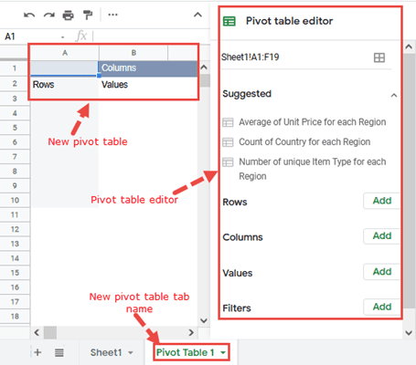
Step 5: At the beginning, your pivot table would be blank as shown in the image below. It will start filling up once you start adding rows, columns and values to the table (explained in step 6).
To the right of your Google Sheets window, you should see a Pivot table editor sidebar. This sidebar displays the following:
- The range of cells on which the pivot table is based
- Some suggestions for pivot tables based on your data
- Options to customize your pivot table according to your requirement. This includes 4 insert options:
- Rows
- Columns
- Values
- Filters
Suggested Pivot Tables
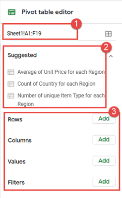
Thanks to the latest A.I. feature Google added in Google sheets you can build pivot tables automatically. Google Sheets provides a few ideas for pivot tables based on your selected data. For example, for our sample data, Google Sheets suggests the following:
- Average of Unit Price for each Region
- Count of Country for each Region
- Number of unique Item Type for each Region
Clicking any of these suggestions will automatically create your initial pivot table. For example, let’s click on the second suggestion: “Count of Country for each Region”:
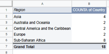
Looking at the above table lets us know at a glance how many countries operate from each geographical region.
It also comes with a query feature that allows you to ask questions, and it will find the data for you in the pivot table.
Step 6: Creating a Custom Pivot Table
The suggestions provided by Google Sheets might not suit your needs, so you also have the option to build your own pivot table manually.
Let us try to build a custom pivot table to analyze the following:
“How many units of each item type were sold on the different sales channels before the year 2014?”
Let’s break this question down to understand exactly what we want our pivot table to show. We want:
- The names of different Item types sold in the form of rows
- The different sales channels in the form of columns
- The value of total units sold in cells where each Item Type meets a Sales Channel
- Filters to display only the data relating to the years before 2014. A filter lets you see parts of the data, while keeping irrelevant parts hidden.
Now that we know what we want, let’s start building our pivot table.
Inserting Rows
To display the list of Item Types in each row, click on the ‘Add’ button next to ‘Rows’ in your Pivot table editor. Select ‘Item Type’ from the dropdown.
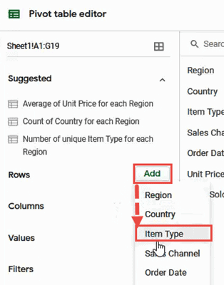
The pivot table will obtain the names of all the Item Types from your data table and display them as shown below:
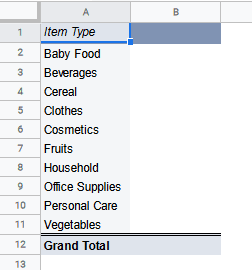
Note that the pivot table has displayed the list of items in alphabetical order and has removed any duplicates.
Inserting Columns
To display the list of Sales channels across each column, click on the ‘Add’ button next to ‘Columns’ in your Pivot table editor. Select ‘Sales Channel’ from the dropdown.
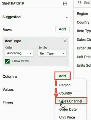
The pivot table will obtain the names of the different Sales channels (‘Online’ and ‘Offline’) from your data table and display them as shown below:
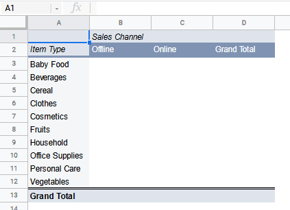
Our spreadsheet pivot table is already starting to take shape.
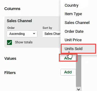
Inserting Values
Now it is time to populate the pivot table’s cells with the number of Units sold for each Item type through each Sales channel. For this, click on the ‘Add’ button next to ‘Values’ in your Pivot table editor. Select ‘Units Sold’ from the dropdown.
You can also add a calculated field to help you customize your pivot table with special functions.
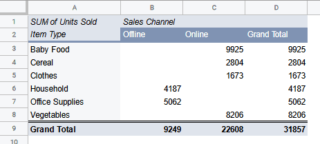
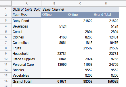
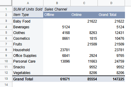
You should now see the sum of units sold for each item on each sales channel.
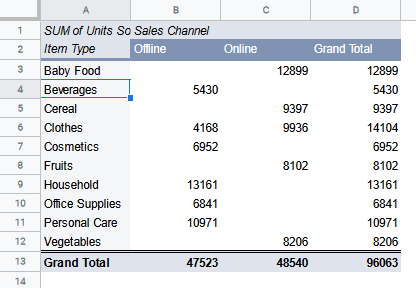
Note that the Units Sold have been summed up and displayed in each cell. So for Baby Food, the pivot table summed up all the units sold Online and displayed them in cell C3.
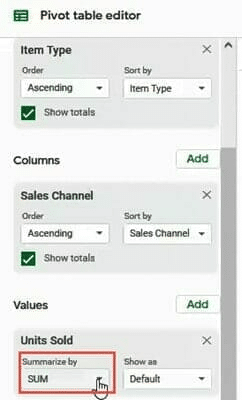
If you want to see the average number of units sold instead of total, simply click on the dropdown below ‘Summarize By’ (under Units Sold) and select ‘Average’.
Note that the pivot table also displays the Grand total of Units sold for each channel (which it automatically calculates) at the bottom of the table. The Grand Total per item is also displayed on the right-most column of the table.
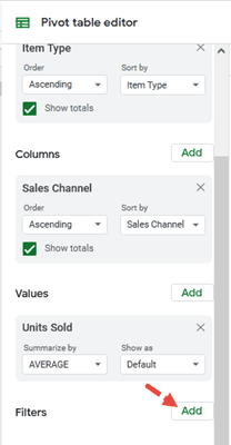
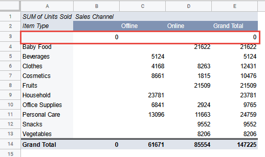
Adding Filters
We are already getting a lot of insights into our data from our created pivot table in Google Sheets. The last thing to do now is to narrow down our results so we see only the total number of units sold before the year 2014. For this we can use filters.
To add a filter to your pivot table, follow the steps outlined below:
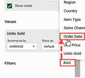
- Click on the ‘Add’ button next to ‘Filters’.

- Select ‘Order Date’ from the dropdown.

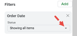
- Click on the dropdown under ‘Status’.

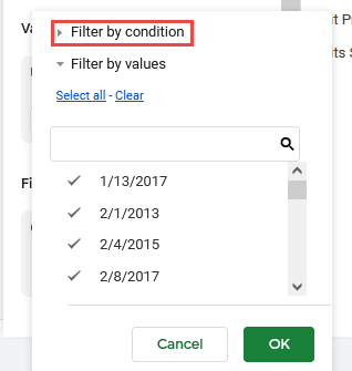
- Click on the ‘Filter by Condition’ category.

- From the dropdown under ‘Filter by Condition’, select ‘Date is before’.
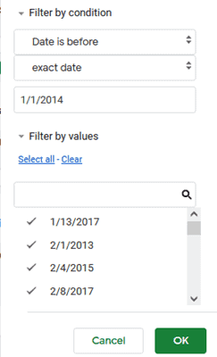
- You should see a new dropdown under this now. Make sure that ‘exact date’ is selected.
- In the input box that says ‘Value or Formula’, type the date ‘1/1/2014’. This ensures that the pivot table only considers the dates before 1st Jan 2014.

- Click OK.
That’s all! We now have a pivot table that displays the sum of units sold for each Item type on each Sales Channel before the year 2014.
You can also filter your table using sheet slicers which are much more intuitive than normal filters. Find out how to add sheet slicers in Google sheets at Google sheets slicer.
How to Create a Pivot Chart in Google Sheets
A pivot chart is simply a chart made from a pivot table. Like pivot tables, a pivot chart helps you get a focused visualization of the important parts of your data. Moreover, since it is based on a pivot table, it offers the same dynamism that a pivot table offers.
Now there is no direct option for creating pivot charts in Google Sheets. You always need to first create a pivot table and then build the pivot chart from it.
Here are the steps to create a pivot chart from an existing pivot table:
- Select your pivot table. Don’t forget to include the headers of the table. You can skip selecting the Grand totals.
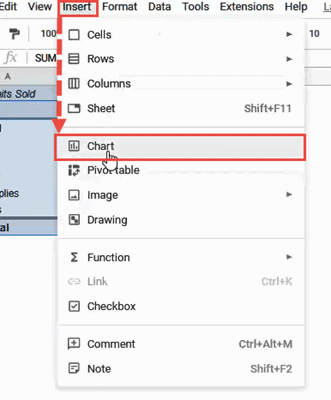
- From the Insert menu, select ‘Chart’.

- This will display your pivot chart on the same page as your pivot table.
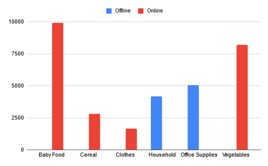
Here’s how the pivot chart based on our sample pivot table looks:
Once your chart is ready, there are a few things that you need to note.
- Based on our data, Google Sheets has assumed a Bar chart to be the best visualization option. However, you are free to select the chart that works best for you.
- Any changes to your original data (and consequently your pivot table) gets updated on your pivot chart.
- You will notice that your chart does not have chart and axis titles. However, you can manually add them as you would for any chart in Google Sheets.
Google Sheets Advanced Pivot Tables
Now that you’re familiar with the basics of creating a pivot table and, subsequently, a pivot chart, let’s move to the level of Google Sheets Advanced Pivot Tables. Let’s move forward and look at some questions you might come across as you practice and start getting better at your pivot table skills.
How to Create a Pivot Table in Google Sheets Mobile
Google Sheets Mobile users might find it difficult to create a pivot table from the app. This is because this feature is not yet available on the app. But if you still want to use your phone to create a pivot table, there’s an alternative route.
- Go to your mobile phone browser.
- Login to your Google Drive.
- Go to the Google Sheets webpage (sheets.google.com).
- You will see the mobile version of the page. Change this to the desktop version of the site.
- Now you can open the sheet that contains your data.
- Create a pivot table from your data as you would create one on any desktop computer.
How to Hide the Pivot in Google Sheets Table Editor
A lot of Google Sheets users would like to have the pivot table editor hidden once they’ve created a pivot table. However, at this point, there really is no way to hide the pivot table editor in Google Sheets from view. Every time you select a cell of your pivot table, the editor sidebar will appear, and there’s not much that you can do other than to simply close it.
Create a Google Sheets Pivot Table from Multiple Other Sheets (and with a Dynamic Source Data Range)
Often we have our data spread out over multiple sheets or tables. However, a single pivot table can only be created from one data span. So inherently, it is not possible to use data from different tables to create a single pivot table.
However, there is a workaround if you really need to use data from multiple sheets in one pivot table. You can use an array to combine all the data tables into one common table, after which, you can use this array (or combined table) to create your pivot table!
Let’s take an example to understand how to do this. Let’s say you have data spread out over two sheets. Say Sheet1 has the following 15 rows:
Say Sheet2 has the following 15 rows:

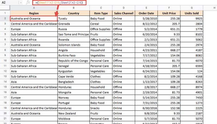
Now the first step is to create an array that combines both tables. Each table has entries ranging from cells A2:G16. So in a new sheet, add the column headers in the first row, and in the second row, enter the following formula:
={Sheet1!A2:G16;Sheet2!A2:G16}
Now this will display all the rows from both the tables, and you can easily create a fresh pivot table from this.
Here’s a pivot table created from this list:

There’s one drawback with this formula though. If your aim is to create a pivot table with a Dynamic Source data range, then this will not work.
This is because your formula is limited to just the cells between A2 and G16 from each sheet. So if you add a new row to any of the sheets, this will not get updated in your array, and thereby your pivot table.
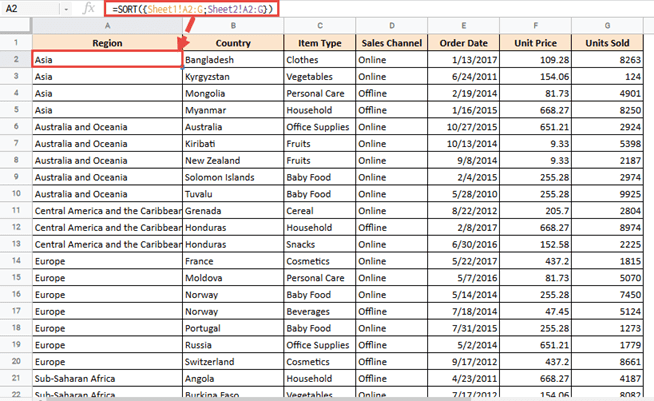
To solve this problem, you can remove the row numbers from the ending cell references in the formula, so that they contain only the column name. So instead of A2:G16, reference the cells A2:G.
This way, no matter how many new rows you add or remove from your original data, the pivot table always remains up-to-date. This means instead of the above formula, you can use the formula shown below:
=SORT({Sheet1!A2:G;Sheet2!A2:G})
Notice we put the array inside a SORT function. This is because the references A2:G will refer to all the rows of Sheet1 and Sheet2. This means all the blank rows of these sheets will also get included in the array. To avoid that, we used a SORT function. This will ensure that all the blank rows of the resultant array are moved to the end, and the non-blank rows are all visible at the top of the array.
We now have a Google Sheets pivot table with a dynamic range!
Another thing you need to do in order to make your pivot table dynamic is to add a filter to it that displays only those rows that are not empty. This ensures that even if you delete a few rows, you don’t end up with blank rows in your pivot table.
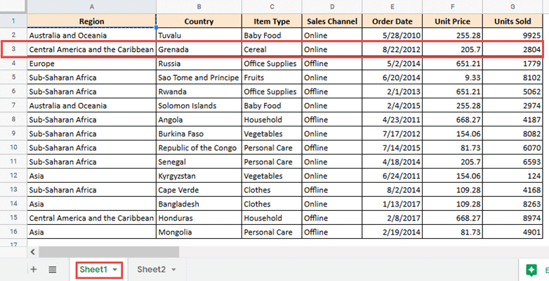
For example, take a look at what happens to your pivot table when you delete row 3 from Sheet1:
Here’s the resultant pivot table:
The first row of the pivot table is now blank because the row containing Item type =”Cereal” does not exist anymore.
To make sure blank rows like these are not displayed in your pivot table, follow the steps shown below:
- From your Pivot table editor, click on the ‘Add’ button under ‘Filters’.
- Select Item Type from the field list that appears.
- In the Item type block under Filters, click on the dropdown under ‘Status’.

- Click on ‘Filter by condition’.
- Click on the dropdown under it and select ‘Is not empty’.
- Click on ‘Filter by condition’.
- Click on the dropdown under it and select ‘Is not empty’.

- Click OK
This should now get rid of any blank rows in your pivot table, and keep your pivot table fully dynamic.
How To Use Pivot Tables In Google Sheets
Pivot tables should be used to summarize huge data sets to make them more digestible. There’s not really much point adding one if the existing data is easy to read. The simple instructions on how to insert a pivot table in Google Sheets are:
- Select the cells you wish to make into a pivot table
- Navigate to Data > Pivot table
- Check if the suggested pivot table is appropriate
- To customize, click Add and/or Filter
Frequently Asked Questions
How Do I Create a Pivot Table in Google Sheets?
- Select the cells you wish to make into a pivot table
- Navigate to Data > Pivot table
- Check if the suggested pivot table is appropriate
- To customize, click Add and/or Filter
What Is a Pivot Table and How Does It Work?
A pivot table is a summary of an expansive set of data. It works by pulling the desired data points into a more digestible format.
How Do I Update a Pivot Table in Google Sheets and Why Won’t It Refresh?
In most cases the pivot table will update automatically when you enter new data. But, there are a few potential reasons why it may not. Let’s take a look at them:
Your pivot table has filters: To remedy this problem simply remove the filters and add them again when the pivot table refreshes.
The new rows are outside the pivot tables range: To fix this, make sure the rows are included in the pivot table editor menu.
You’re using filters or formulas that require refreshing: If you use formulas such as NOW, TODAY, and RAND your pivot table won’t automatically update.
How Do I Add an Editable Column to a Pivot Table?
- Click on the pivot table to open the editor
- Click Add next to Column
Can You Create a Pivot Table From Multiple Tabs Google Sheets?
Unfortunately, you can’t pull the data from multiple ranges. You’ll have to combine the data into one sheet first.
How Do You Aggregation Types in a Google Sheets Pivot Table?
Change the option in the Summarize by: dropdown menu to the desired aggregation type, such as AVERAGE. It will be set to SUM by default.
How Do You Format A Pivot Table In Google Sheets?
You can’t change formatting in pivot tables. Instead, you have change the formatting in the source data.
How do I Automatically Update a Pivot Table in Google Sheets?’
This is a question most Excel users might ask. However, unlike Excel, Google Sheets automatically refreshes pivot tables when the original dataset gets changed, so they don’t need to be manually refreshed.
There may still be situations where you find the data in the pivot table not getting updated. In such cases, check out our tutorial on “How to Refresh Pivot Table in Google Sheets”, where we speak in detail about the possible causes and solutions for this.
Conclusion
A spreadsheet pivot table will help you look at your data from different angles and perspectives. They condense your data such that you get maximum information with minimal distractions. In this pivot table Google Sheets tutorial, we introduced you to pivot tables and showed you how to create one with a simple example. We also showed you how to create a pivot chart in Google Sheets from a pivot table and answered some questions that are commonly asked by Google Sheets users when creating pivot tables. We hope this step-by-step tutorial was informative and helpful for you. We have more tutorials, like how to make a table in Google sheets, that might be helpful to you.
Related: