Watch: How to Create a Combo Chart in Google Sheets
Visualizing data is one of the strong points of using spreadsheets for data entry. While separately having a line and bar chart can make it simple to understand data points, combining them into a Google Sheets combo chart is often a good idea. This allows you to make direct comparisons between data points, identify correlations, and forecast decisions based on your data.
In this guide, we’ll cover everything you need to know about combo charts in Google Sheets and some hands-on, step-by-step examples for you to follow along with. Download our example spreadsheet, and keep reading to learn more.
Table of Contents
What Is a Google Sheet Combo Chart?
Usually, a column chart and a line graph are combined to create a combo chart in Google Sheets. But, two Line or Column Charts could be combined into a single diagram.
Simply put, a Google Sheets combo chart merges two or more different chart styles, such as the Bar Chart and Double Axis Line. When displaying insights from your data, using numerous chart types in one view simplifies data points’ direct comparison and correlation.
To create a combo chart, you need two datasets with a common string field, like time. You may present data in a variety of ways with the help of this visualization design. Additionally, it serves as the foundation for other complex charts like the 80/20 or Pareto representation. To create a combo chart, you need two datasets with a common string field, like time.
When Should You Use a Combo Chart?
Combination charts are a handy supplement to many reports and presentations since they offer a versatile means of showing data. They serve as the foundation for analytical techniques like the Pareto analysis.
Using a combination chart can be ideal in situations like:
- Cases with varying data types, such as volume and price.
- When you need to show the relationship or the trend between two or more data types.
- When the results in your data widely vary across the different data types.
- When you need to identify the outliers in the data.
- When you wish to show the data shape rather than the actual data value in the spreadsheet.
Elements of a Combo Chart Google Sheets
While each combo chart can be quite different from the next, they share some points that make them similar.
Data
The most important element of this visualization design is the data. Make sure you have enough data samples before constructing a Combo Chart. Make sure to use data with various metrics of interest to get the most out of this chart. You will also need one common data axis to plot the two graphs on one plane.
Plot
To complete your goal successfully, you want one of the axis to have points that can be plotted together. The passage of time is a great Y-axis for combo charts. You can visualize your data using various tools and combination chart layouts.
Labeling
To help your audience to comprehend the context of your data story, label your graphic appropriately but not unnecessarily. You can include legends and a title to make your readers understand your findings. Also, giving your chart a name separates it from other charts and prevents confusion when using Google Sheets dashboards.
How to Make a Combo Chart in Google Sheets
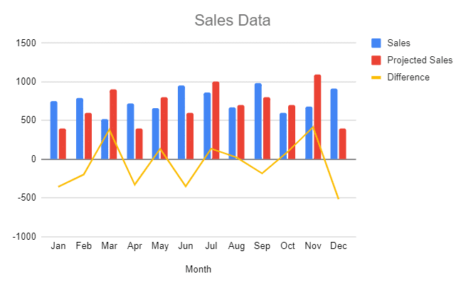
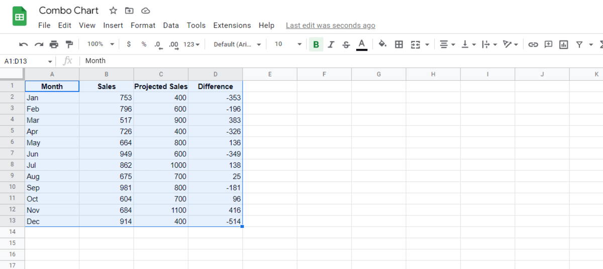
Now that we know the basics, let’s look on how to combine two graphs in Google Sheets. In this example, we have a set of data that represents the sales, projected sales, and their differences over a year. We want to represent the sales beside the projected sales data and show the difference using a line.
Here’s how to combine two charts in Google Sheets:
- Click the first cell containing the data and drag your cursor across the data to select it. Make sure to include the labels in the heading of the data. The highlighted data will be represented by a thick blue border, and the data will have a light blue highlight.
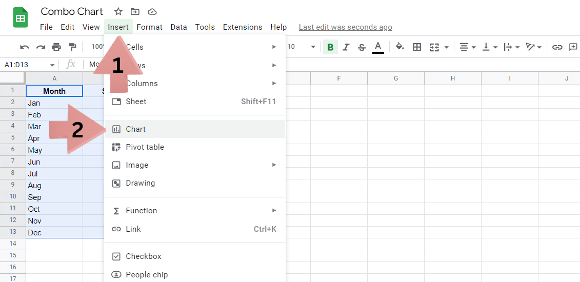
- Click the Insert button in the main top bar. This will open a dropdown menu. Click the Chart button there. This will open the Chart editor towards the right part of your screen.
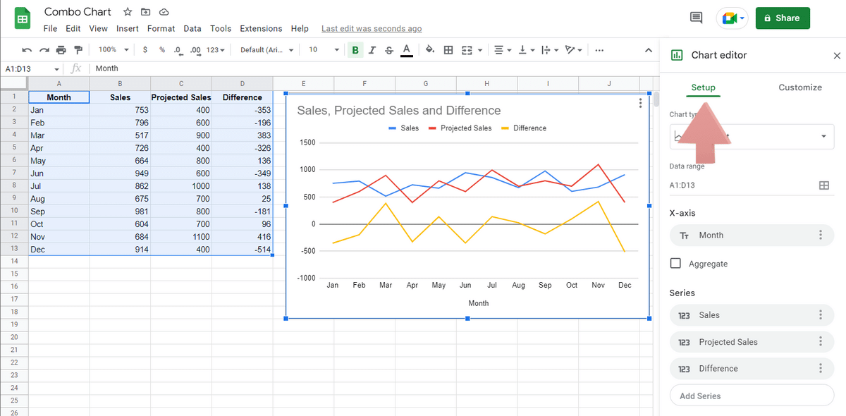
- Click on Setup towards the upper-part of the window, which will take you to a section where you can choose the type of chart you wish to display.

- Click the box under Chart type, which will open a new menu where you can change the chart type. Scroll down to find the Combo chart option.
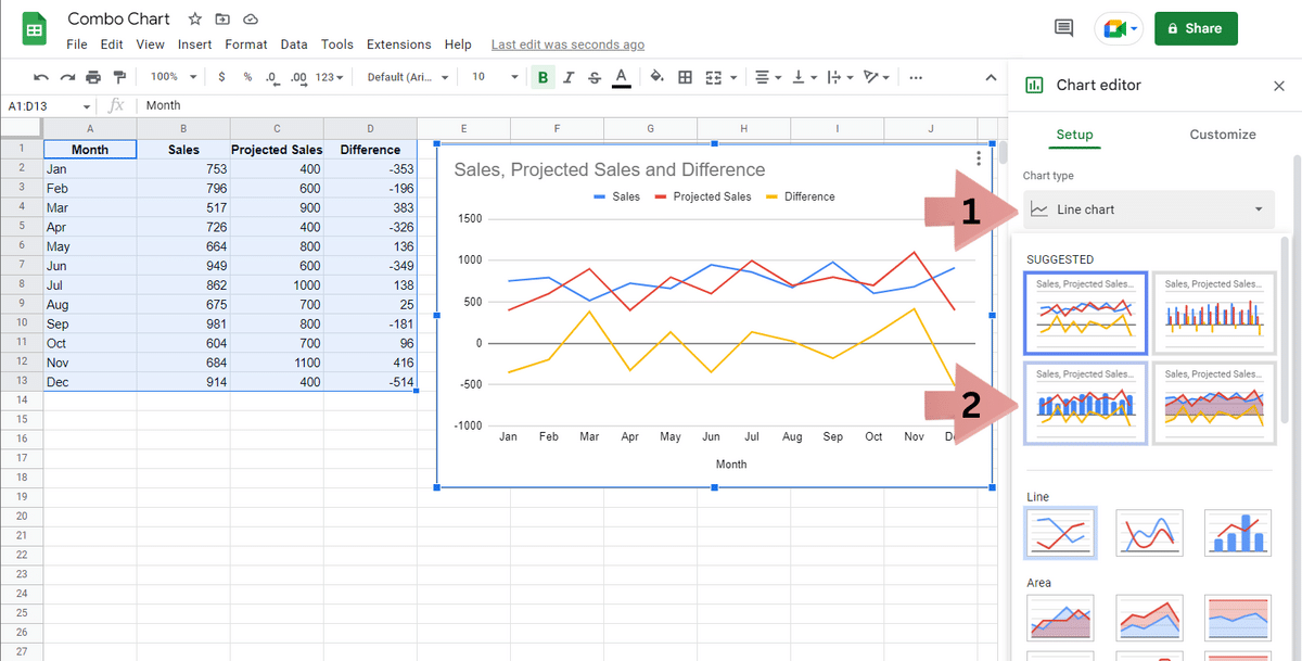
Once the chart type is changed to a combo chart, you will notice that the data probably isn’t shown as you would like it to be. The first thing we want to do here is to change how the combo chart to be presented. To do this, follow these steps: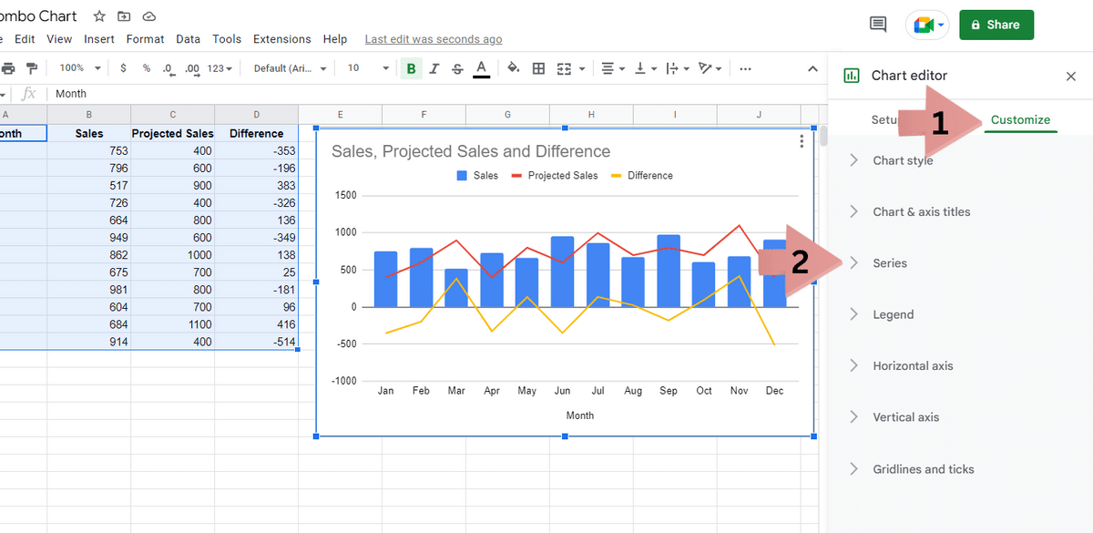
- Click the Customize button towards the upper-part of the chart editor, where you can change the chart’s appearance.
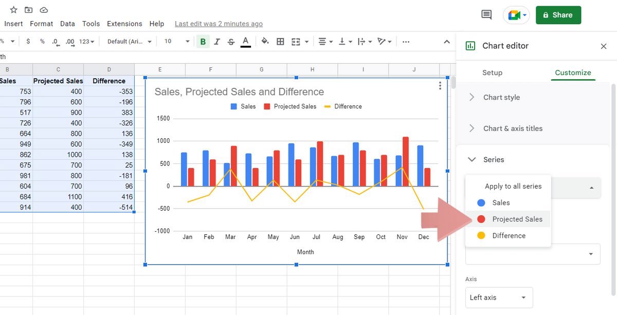
- Click on Series to expand that section.
- At the upper-part of the section, you can see an Apply to all series button. Click on it to open a dropdown menu where you can select the series you want to apply the changes to. In this case, we wish to change the Projected Sales data from a line to a column graph.
- There, click under Type in the Format section and change the type of graph you want to display. In this case, we want it to be a column graph.
While we wanted to change the series to a bar chart, you may want to do it differently, depending on your data points. So,feel free to make changes to your heart’s desire. Once you’re done, Click the cross icon towards the top-right of the chart editor to close the window. The changes made to the chart will save automatically.
How to Edit the Visual Appearance of Your Combine Charts in Google Sheets
Double-click the chart, and then open Chart Editor on the right side of your screen when you open it. Select Customize from the editor’s menu at the top. You can alter the chart’s design here, allowing you to brand it with your business’s colors or other visual effects.
Let’s take a look at the steps you need to follow to change the visual appearance of your combined chart in Google Sheets:
- Click the chart to highlight it. This will be shown with a blue border around the chart’s edges.
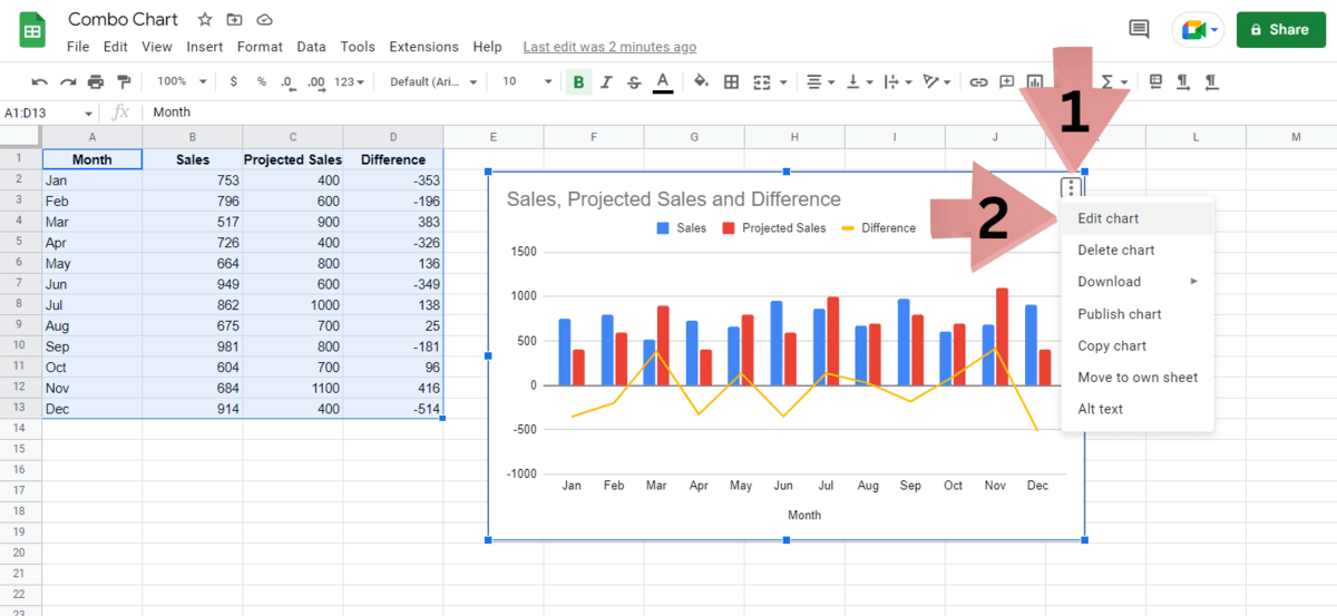
- Now, Click the three vertical dots icon towards the upper-right part of the chart. This will open a dropdown menu with a list of options for you to choose from.
- Here, select the Edit chart option. This will open the familiar chart editor towards the right part of your screen.
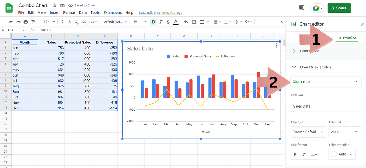
- Click the Customize button at the top part, which will take you to the section allowing you to change the appearance of your chart.
- First, we wish to change the title to something that better represents the data. To do this, Click the Chart & axis titles option, which will allow you to change the names of the various elements in the spreadsheet.
- In the first option, select the Chart title option.
- There, enter the new name for the title in the Title text textbox.
- Now, we wish to change the fill color for the bars in the combo chart. To do this, in the Customize section, click on Series. There, select the series you wish to change the color of.
- Once the series is selected, feel free to change the options. If you wish to change the color of the bars, Click the Fill color option and choose the color of your choice.
Things You Can Edit in the Chart Editor
Now that you know how to combine graphs in Google Sheets, let’s look at some things you can edit inside them:
Chart Styles
- The elements of the overall chart can be modified here.
- The border, text, and background are all customizable in this section.
- Checkboxes:
- Smooth: this option will eliminate the line chart’s rough edges.
- Maximum: this removes the white border gap and increases the size to its maximum.
- Plot null values: By turning this on and off, the null or blank values are displayed or removed.
- Compare mode: It allows you to make comparisons to prior values.
Chart and Axis Titles
Here, you can make changes to the Title, Title Color, Font, and other parameters of the chart.
Series
- You may change the combination chart visualization using series.
- It will be set to Apply to all series when you first open this. You can adjust it to the series you want to edit.
- The type (columns, area, and line), color, dash type, opacity, thickness, and axis sides can all now be changed.
- Further options include error bars, trendlines, and data labels. All of these can increase the message’s effectiveness in the data.
Legend
The legend’s position, color, and font can all be modified in this section.
Horizontal Axis
The Horizontal Axis’ position, color, font, and slant are all changeable.
Vertical Axis
The Vertical Axis’ position, font, scale, number format, minimum and maximum values, and color can all be altered.
Ticks and Gridlines
- Both the vertical and horizontal axis’ ticks and gridlines are editable.
- In this case, the vertical axis has several options. You can choose different ticks and gridlines. You can also adjust the spacing, count, step, and color.
- In this example, there is only one option on the horizontal axis, which also has ticks along it.
Related Reading: How to Make a Google Sheets Pie Chart
How to Understand a Google Sheets Combo Chart
It’s all well and good to have combo charts in your spreadsheets, but they’re useless without being able to interpret the data. Here’s a quick guide to understanding Google Sheets combo charts.
Understand the Important Data Points
To comprehend the graph, you must know the context and the key metrics. For instance, if you were to use a combo chart to compare sales between teams, you must understand how specific data relates to your workplace or a company’s strategic goals when it comes to sales.
Examine the Pattern
Look at the bars and lines in the combo graph to comprehend the overall pattern. Keep a record of the high and low points. You may also want to consider adding lines of best fit to your charts to help you identify trends in your data.
Identify Outliers
An observation that deviates from the trend or pattern in your data is referred to as an outlier. Because they are singular events, outliers can mislead decision-makers. Finding outliers in your data is can be simple, here’s an example; Imagine that the sales at your place of business or employment have been increasing over the past three years. But, it dropped by 70% in a month before returning to the average sales again. The singular event may have been caused by the pandemic or some other extreme outside cause.
You can often ignore this data. You can identify the outliers in charts as they are nowhere near the other data points in the combo charts.
Best Practices for a Combo Chart in Google Sheets
Here are some of the best practices you need to follow when looking at how to combine charts in Google Sheets
Bar vs. Column
Choose between using columns or bars, not both. Keep in mind the contrast between the two: Bar charts have a horizontal orientation. Column graphs, on the other hand, have a vertical shape. Your decision should be determined by your target audience. Column graphs are usually better to use with line graphs or even used as a Google Sheets histogram.
Scale
The two y-axes in your chart should be displayed using contrasting colors. To ensure that your readers or audience understand the significance of the data, don’t forget to include a legend.
Avoid Clutter
You’ll undoubtedly be tempted to fill your Google Sheets Combo Chart with information as a visual data storyteller. But remember that clutter may stand in the way of getting the buy-in you want. An excess of details may hide the important lessons you want your audience to identify.
Frequently Asked Questions
What Are Combo Charts?
A combo chart combines two or more different chart styles, such as the Bar Chart and Double Axis Line. When displaying insights from your data, using numerous chart types makes it easier to see data trends.
What Are Combo Charts Used For?
You can use combination charts to present insights into many metrics from a single perspective. They can also be used to graphically emphasize the variations across data categories. This chart needs to be your go-to tool if your objective is to conserve space and produce a lean data visualization dashboard.
How Do I Add a Series to a Combo Chart in Google Sheets?
To add a new series to an existing combo chart, go to the chart editor by clicking on your chart first and then clicking on the three vertical dots towards the top-right corner of the screen. In the chart editor, make sure you’re in the Setup section. You can do this by clicking on Setup in the main top bar. There, in the Series section, click the Add Series button. Here, click the box icon to open a text box in the middle of the screen. You can enter the cell range for the new series you wish to add to the spreadsheet.
Can You Do a Stacked Bar Combo Chart in Google Sheets?
To do a stacked bar combo chart, go to the chart editor by clicking on your chart first and then clicking on the three vertical dots towards the top-right corner of the screen. In the chart editor, make sure you’re in the Setup section. You can do this by clicking on Setup in the main top bar. There, Click the Stacking option under Chart type and select Standard. This will convert your normal bar chart into a stacked bar graph. You can also change the colors of the bars in the chart by clicking and heading to the Customize section and then Series. Select the series you wish to change the color of and then change the Fill color.
Wrapping Up the Google Sheets Combo Chart Guide
We’ve covered how to set up a Google Sheets combo chart and edit the parameters to customize it. Combo charts are great, but you may need to use some other charts too. Check out our other charting guides to learn everything you need to know about this area of Google Sheets.