When creating a chart in Google Sheets, the software tries to understand your selected data — and automatically picks a column for your X and Y-axes. However, the axes it picks might not always match what you want.
In this tutorial, I will show you how to switch X and Y axis in Google Sheets in two minutes.
Table of Contents
How To Switch X and Y Axis in Google Sheets with Chart Editor
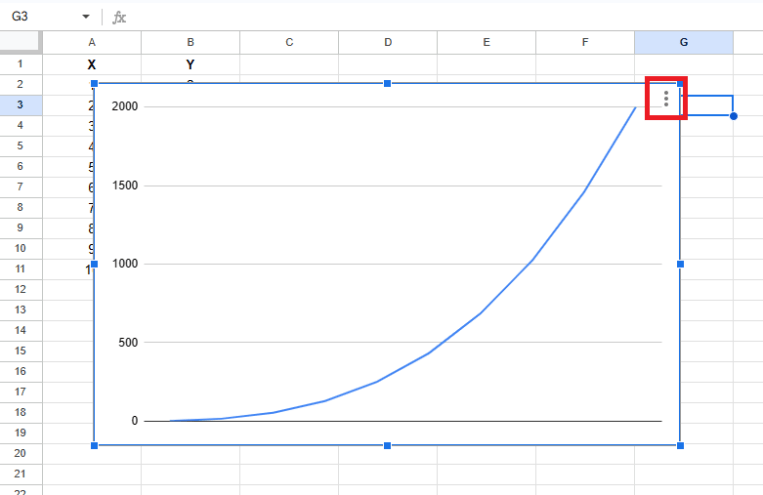
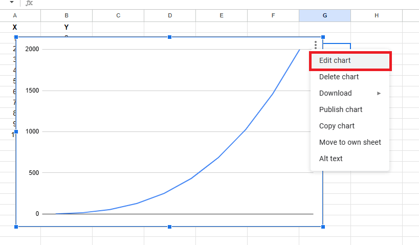
- Click on the graph to select it, then click on the ellipsis icon at the top right of the chart.
- This will open a drop-down menu. Select “Edit Chart.”
- Alternatively, you can right-click the chart and select “Data range” from the context menu that appears.
- Click on the “Edit Chart” button to open the “Chart Editor” window on the right side of the screen.
- Here, you can personalize your chart and style settings by specifying the sources you’re extracting data from.
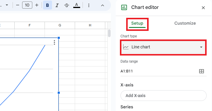
- Select the “Setup” tab from the “Chart Editor.”
- Here, you can choose the appropriate options to change the chart type, the axes, and the data range.
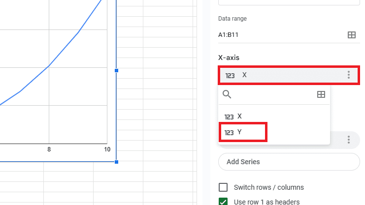
- You’ll see labels for “X-axis” and “Series.”
- Click on the option under the X-axis and change it to your preferred parameter.
- In this case, you’ll change it to Y.
- Repeat this step and change the “Series” option to the parameter for the X-axis.
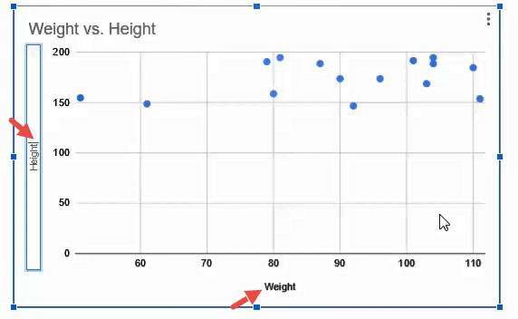
Note: If there are more than two columns in your chart, the names will also be displayed under this category. The first column name is generally selected to represent the Y-axis.
To change this column, click on the column name (weight in our example). Select the column you want to use as your Y-axis from this list.
In this case, I must select the “Height” column name. Once done, you should see the same data (though it will be represented with the axes switched).
How To Switch X and Y Axis in Google Sheets’ Labels
You should also know how to switch the X and Y axis in Google Sheets labels (and the axes have changed their source columns). This is important because it gives a fresh perspective on your data analysis and helps identify new patterns and trends.
Consider a scatter plot where the X-axis is “Height” and the Y-axis is “Weight.”
- Double-click on the label text and type in the new axis label.
- Click anywhere outside the text container.
If you want to change the columns in the axes (instead of just switching them), a good option is to remove one axis at a time, re-adding it with a new column name.
How To Remove or Add an Axis
The process is simple if you need to remove or add an axis in Google Sheets. Just follow the steps below:
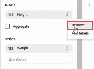
- Click the ellipsis next to the column name listed under the ‘X-Axis’ or ‘Series’ category in the “Chart Editor.”
- Select the “Remove” option from the drop-down list that appears.

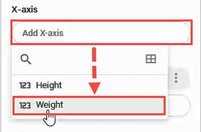
- If you delete a column and want to re-add it back into your chart with a new column name, click on the “Add X-Axis” or “Add-Series” box (whichever is relevant).
- Select the new column name from the drop-down menu that appears.
Now that you know how to use Google Sheets to switch either the X or Y axis, it’s easy to update your chart to show your selected dataset.
Related: Learn how to create beautiful charts.
How To Graph X and Y Axis on Google Sheets
If you’re looking to create a graph in Google Sheets:
- Open the spreadsheet to create the graph/chart with the dataset for the X and Y axes.
- Click and drag your cursor over the table to select it.
- Your selected dataset will be highlighted in blue.
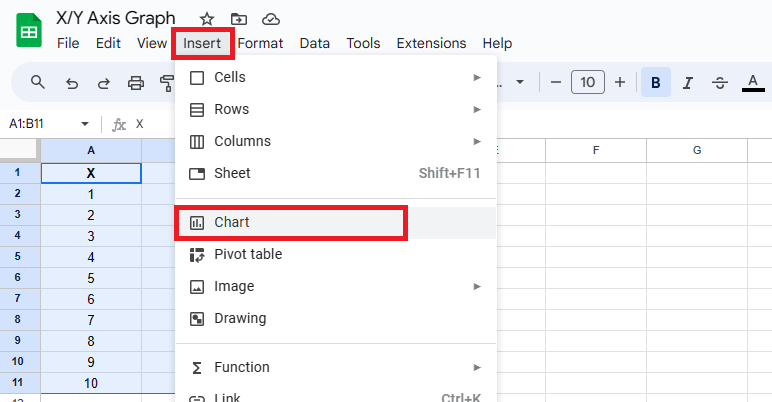
- Click “Insert” > “Chart” button in the drop-down menu.
- This will open the “Chart Editor” menu, displaying the different types of charts you can select from the drop-down menu on the right side of the screen.
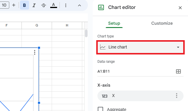
- In the “Chart Editor,” click “Chart type” and select the type of chart you want to create.
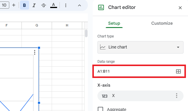
- Ensure the data range contains the correct cell range.
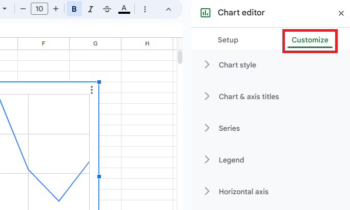
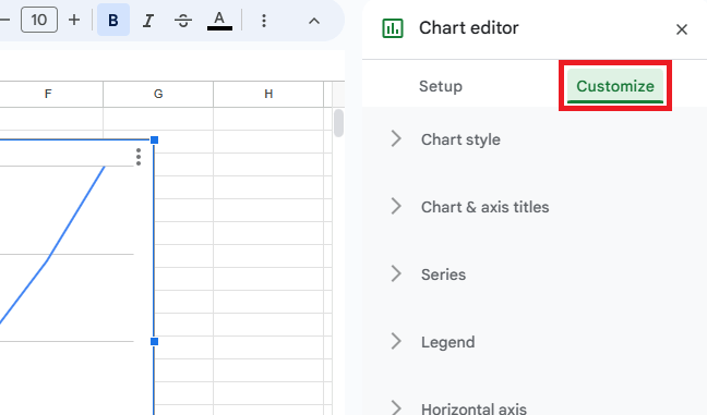
- To customize the chart, click the “Customize” button.
- You can select the appropriate options to make visual changes to the chart.
How To Graph Equations on Sheets
You may have an equation in the cell. When plotting graphs for cells that contain formulas, Google Sheets will treat them the same way as cells with raw numerical values. This means the process should be the same as if the formula’s output is numerical.
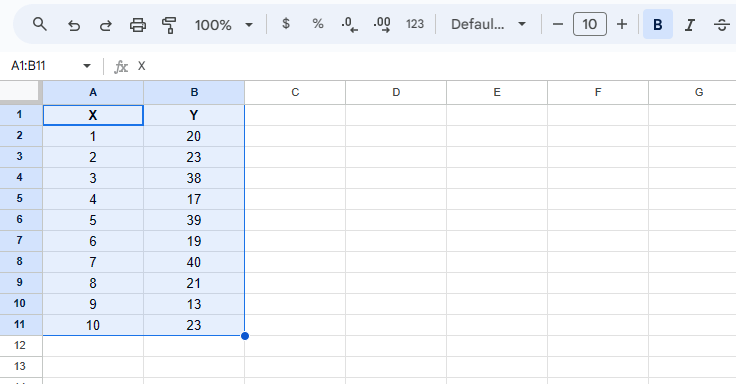
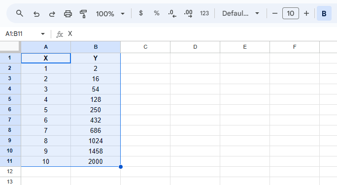
For this example, I have the following dataset:
- Values for X-axis are between 1-10
- Y-axis uses the formula =2*(N^3)
- N is the corresponding value of X.
To create a chart:
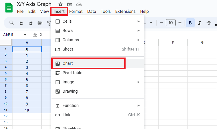
- Click on the first cell and drag the mouse to select the dataset.

- Click “Insert” > “Chart” to open the “Chart Editor” and add a chart.

- In the “Setup” section, under “Chart type,” select the chart type from the drop-down menu that you want to create.

- Click on “Customize” in the header bar.
- Select the appropriate options for your chart.
Related: Learn how to create multiple data ranges in Sheets.
Frequently Asked Questions
What Are the Y-Axis and X-Axis?
In a 2D graph, the X and Y axes are two lines at a 90-degree angle intersecting at the origin point 0.
The X-axis is horizontal and showcases values or categories. The Y-axis is vertical and represents corresponding values for each point on the x-axis. Together, they display the relationships or points of your data.
For example, if you want to create a graph using temperature and time, the X-axis will represent the time values, and the Y-axis will represent the temperature. Plotting an “XY graph” makes visualizing the relationship between these variables easier.
What Types of X and Y Graphs Exist?
There are multiple types of X- and Y-axis graphs, and which one you choose will depend on your personal preferences and the type of data you have. The most common graphs include:
- Bar charts – These charts are used when comparing information segments or variables, such as age groups, classes, or schools. They are commonly used because they provide a simple visual form of large datasets, allowing users to see data trends at a glance.
- Line graphs – These graphs track changes over periods of time. They are more helpful than bar charts when comparing data points over a specific period. The data points are connected by straight-line segments on two axes, making viewing and tracking changes easier.
- Histograms – These charts are helpful when dealing with large data sets. They are popular because they versatilely display data, offering easy-to-view insights into frequency or data distribution.
- Scatter plots – These graphs identify the possible relationship between two sets of variables by marking the changes. They provide a clear visual and statistical graph indicating the strength of a relationship between two variables.
Can You Swap or Flip Axis in Google Sheets?
Yes. It is straightforward to swap the X and Y axes in Google Sheets. Follow the easy steps below:
- Open up the “Chart Editor.”
- Select “Customize” to edit your axes.
- Change the X-axis data to the Y-axis data.
- Change the Y-axis data to what was in the X-axis.
Wrapping up
In this tutorial, I have shown you how to switch the X and Y axis in Google Sheets. You also learned to change the columns representing your chart’s X or Y axes and learned the difference between the graphs, so the next time you create a chart, it should be perfectly aligned to meet your needs and preferences.
To discover more about Google Sheets, Udemy offers many guides to increase your understanding and productivity!
Related: