A Google Sheets heat map is a great way to add color to a boring spreadsheet, making it much easier to read and more visually appealing.
Luckily, Google Sheets has simplified creating a heat map by using the conditional formatting feature, which highlights and customizes your data so you can choose your color scheme, making it easier to view.
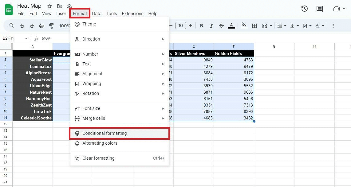
Additionally, it’s also easy to set up. Navigate to “Format” > “Conditional formatting” > “Color scale,” and then fill in the “Midpoint” according to your preferences — Midpoint and Maxpoint.
Keep reading as I explain the alternative uses for a Google Sheets heat map and discuss the different methods to create heat maps.
Feel free to make a copy of my example spreadsheets to make it easier for you to follow the article as I explain the intricate details of using a Google Sheets heat map.
Table of Contents
What Is a Google Sheet Heat Map?
A Google Sheets heat map represents data in a spreadsheet by color-coding the values in the cells. They can show the extremities in the dataset using a gradient color, making the dataset visuals more appealing.
The high and low values can be represented with extreme color variations, whereas the average values can be defined with mute colors. This allows users to identify the maximum and minimum values quickly and easily.
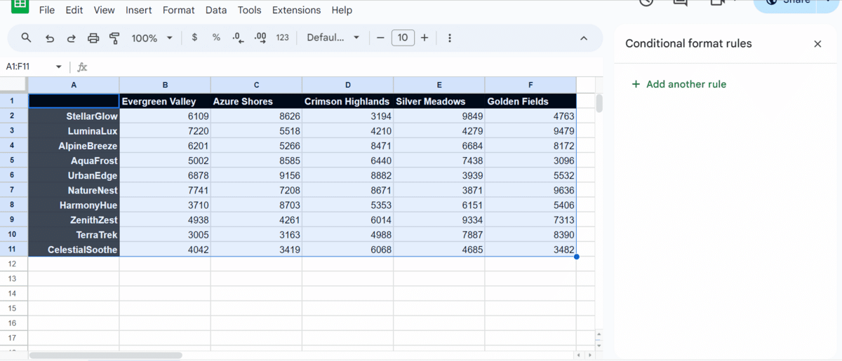
For example, I have a spreadsheet with the sales data range for various products in different regions. The cells contain the sales numbers for the products in the different areas.
Looking at raw, complex data can be tedious, especially with a large dataset. In such cases, I would make a Google Sheets heat map to filter and differentiate the data using shades of red and green.
Why Use a Google Sheets Heat Map?
I like to use a Google Sheets heat map in my spreadsheets for several reasons, such as:
Trend Identification
By using colors to represent values in the dataset, heatmaps help me identify patterns or trends in my data efficiently. For example, a heat map can help me see which products are underperforming in specific regions in a sales report.
Risk Assessment
A Google Sheets heat map is extremely helpful in identifying risks. I use them to identify the likelihood and potential impact of risks visually. This can be helpful in a stock portfolio template where a heatmap can show which assets are performing well and the ones that may need my attention.
Performance Analysis
Heatmaps are also helpful in work environments and can be used to analyze performance metrics like customer satisfaction or employee productivity.
Process Optimization
A Google Sheets heat map can be used to analyze workflows and processes. I use them to identify any bottlenecks in the process to improve them.
Now that I’ve explained some of the common use cases of heat maps in Sheets, let’s look at how to create one in my 2-minute video below! Or keep reading to see the step-by-step instructions.
[adthrive-in-post-video-player video-id=”q65GyRrQ” upload-date=”2024-01-25T12:57:48.000Z” name=”Heatmap in Google Sheets” description=”To create a heat map in Google Sheets, select your data and choose color scale in the conditional formatting menu.” player-type=”default” override-embed=”default”]
Related: Alternate Row Color in Google Sheets: Simple Guide
How To Create a Heat Map in Google Sheets
There are multiple types of heat maps that you can create in Google Sheets. Below, I’ll show you several examples of heat maps in Google Sheets.
Single Color Heatmap Google Sheets
Single-color heatmaps are extremely useful in Google Sheets because they data visualization within the specified data source at a glance.
For example, if data points are above or below a certain figure, here’s how you can create a simple single-color heat map in Sheets:
- Open the spreadsheet. Then, click and drag your cursor across the data to select it.
- Ensure you only select the data you want to apply the formatting to.
- Click “Format” and “Conditional Formatting” in the drop-down menu.
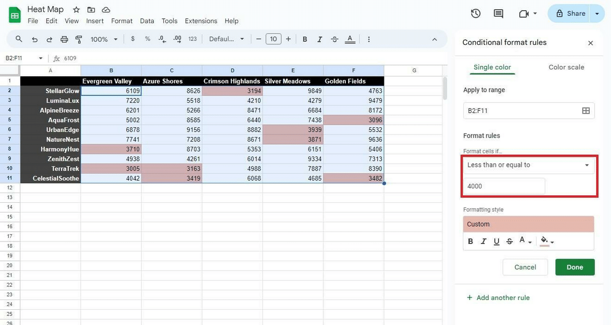
- In the “Single color” tab, click on the “Format cells if” box in the “Format rules” section.
- Choose the rule where you want to apply the values.
- I highlighted all values under 4000 in this example and applied the “Less than or equal to” rule.
- Once the rule is selected, enter the value in the textbox under the rule.
- In this case, I wrote the numeral figure 4000.
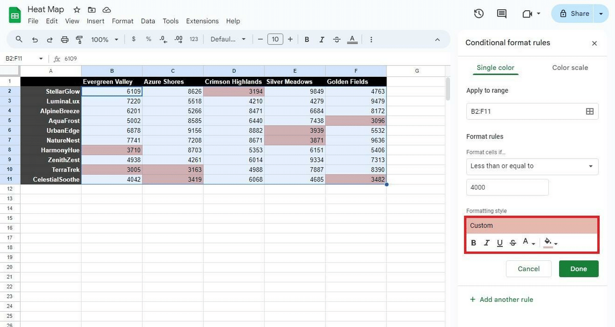
- With the rule defined, choose the “Formatting style” to apply to the cells that fulfill the specified condition.
- Here, you can customize additional features, such as “Typography” effects, Text color, and Fill color.
- In this example, I want to change the fill color to red.
- Click the green “Done” button to confirm and save the changes.
Related: How To Highlight the Highest or Lowest Value in Google Sheets
Multi-Color Heat Map Google Sheets Guide
As the name suggests, this heatmap in Google Sheets uses different colors to represent the values in the data. Follow the steps below to create a multi-color Google Sheets heat map:
- Open a Google spreadsheet in your browser. Click and drag your mouse to select the data in the table.
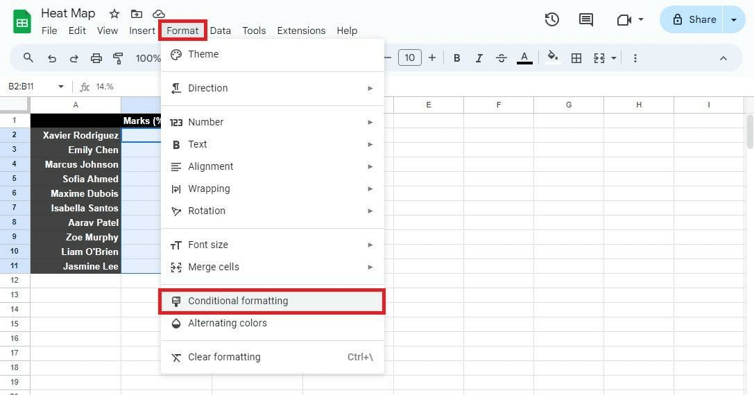
- With the selected data, click “Format” and “Conditional Formatting.”
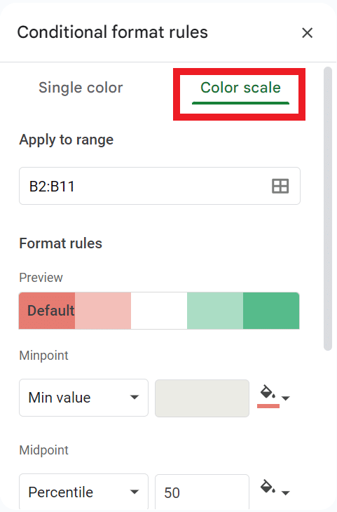
- A sidebar will show up towards the right side of the screen. Click on “Color scale.”
- Select the color scale you’d like to use.
- By default, the percentile will be set to 50%, but you can change it according to your preferences.
- You can also customize the colors to represent different numerical points in the dataset.
- Click on the textbox under “Minpoint, Midpoint, and Maxpoint” and add the values.
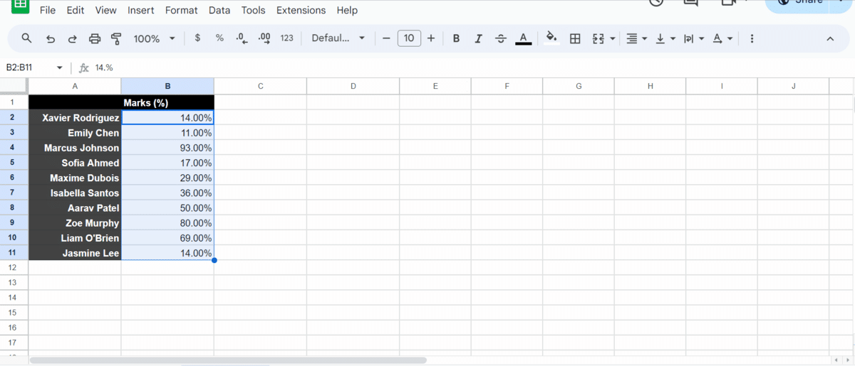
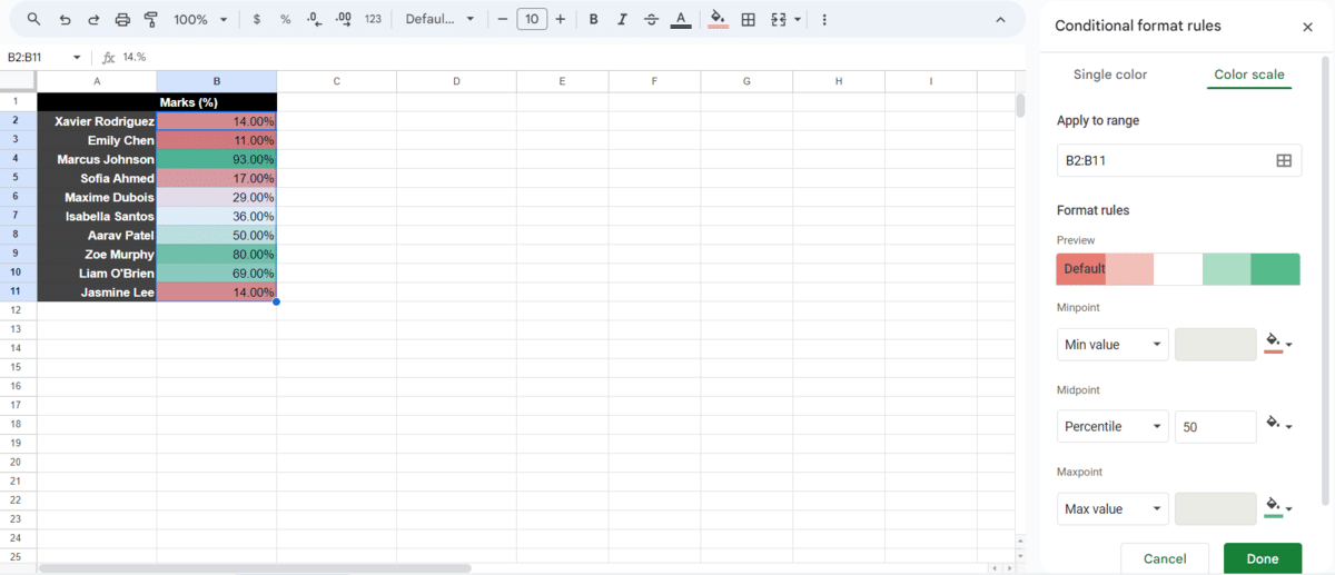
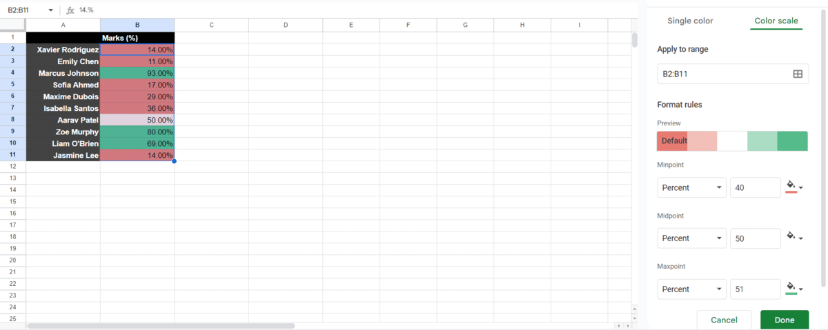
- For this example, I want all student marks above 50% to be represented using green.
- Students at risk of failing with marks between 40% and 50% are represented with white, and students who fail are represented with red.
- Note: You can use a single percentile instead of choosing three values. You may also have to use the drop-down box to change the type of data to consider.
- After choosing the desired options, click “Done” to save your preferences.
Related: Conditional Formatting in Google Sheets
Geographic Heat Map Google Sheets
Another helpful Google Sheets heat map is the geographic heat map, which is helpful when viewing data points on a map. Geo maps offer a visual representation of data locations, where colors are used to identify the intensity of data at various locations.
Keep reading to learn how to make a geographic heat map in Google Sheets:
- Open Google Sheets and select the data to create the geographic heat map.
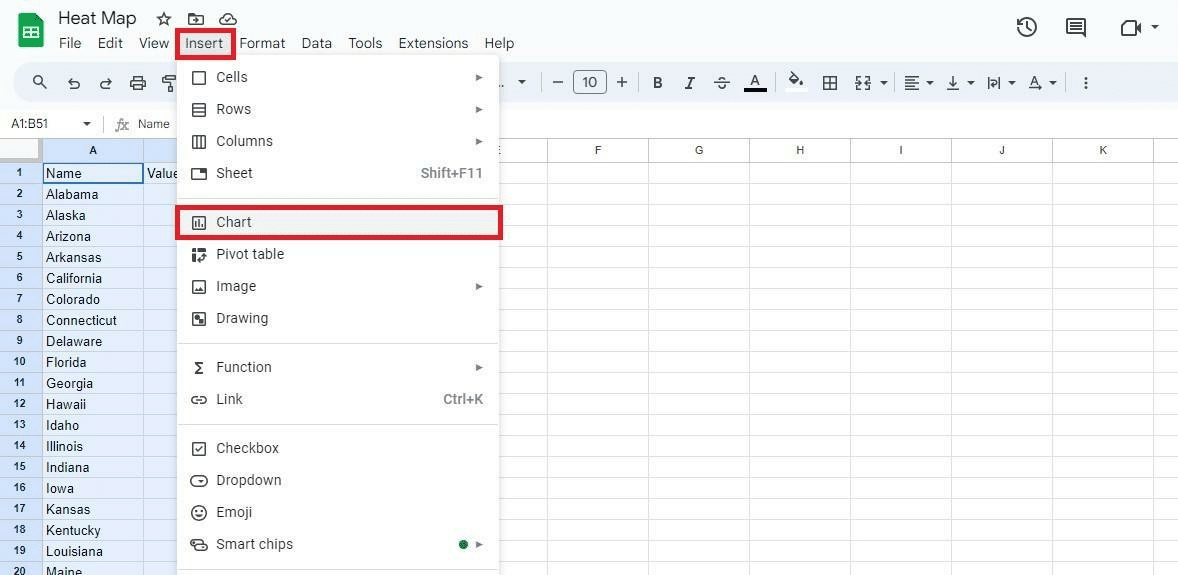
- With the data selected, click “Insert” and then “Chart.”
- This will add a chart to the main spreadsheet and open the “Chart editor” on the right.
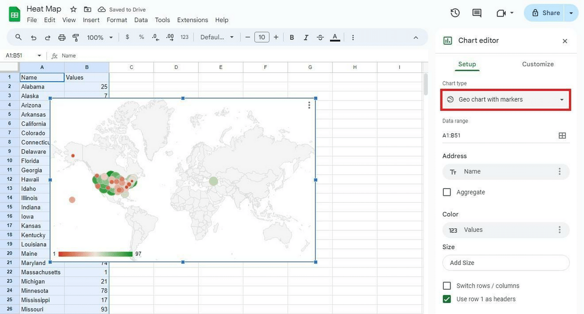
- To change the chart to a geographic one, click “Chart type” and select “Geo chart with markers.”
- This will create a chart with a map of the world.
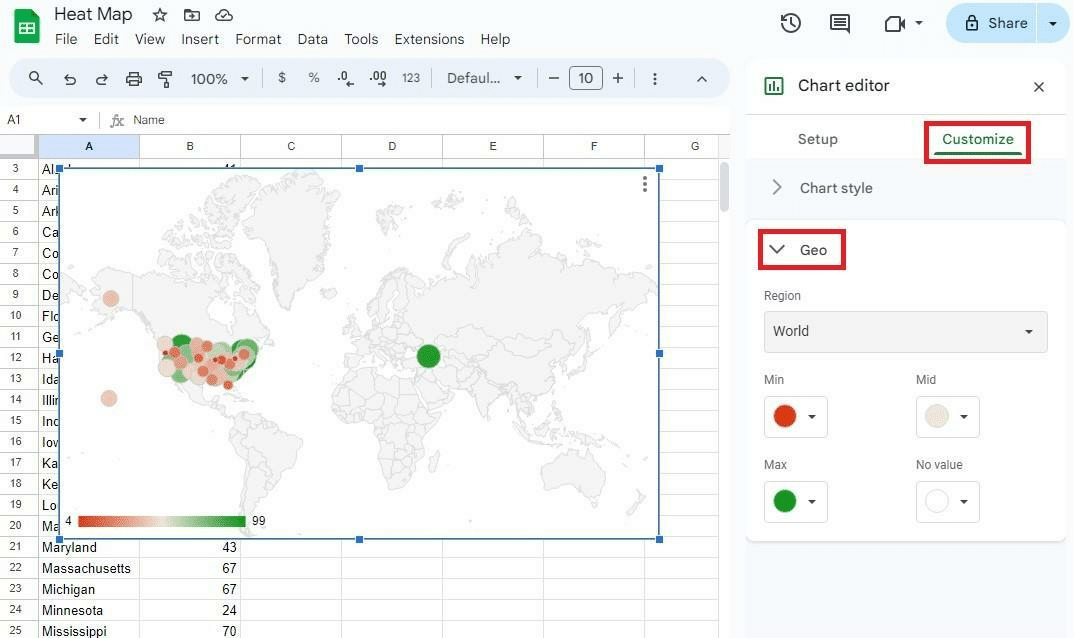
- To change the settings, click on the “Customize” tab.
- You can select a region or change location colors.
- There, click on “Geo” to expand it.
- Customize the map according to your preferences.
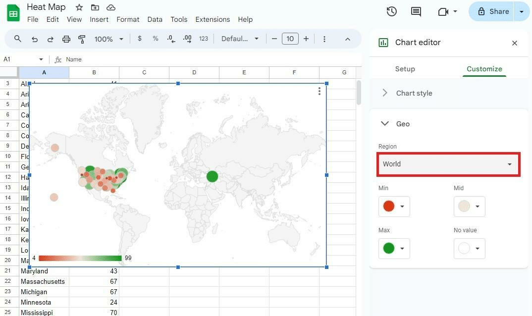
- Click on “Region” and select the desired area.
- I have data from the United States, so I chose to zoom in on the American region map to show the relevant data.
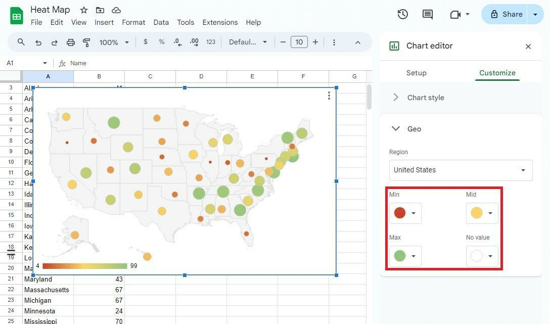
- Customize the “Min, Mid, and Max” colors according to your preferences.
- The colors used will represent those values. Therefore, you can also specify a color to be shown if there is “No value.”
- After making the necessary changes, click the cross button (X) to close the “Chart editor.”
Related: How to Use Color Scale in Google Sheets
Conclusion
At first glance, creating a Google Sheets heat map may look like a daunting task. However, creating one can take less than a minute once you know the steps.
Heatmaps are a great way to represent data visually while accessing insights with one glance. If you are short on time, check out some of my pre-made templates for Google Sheets at the SpreadsheetPoint Store. Don’t forget to use “SSP” for a 50% discount on all templates!
Why are you using heatmaps in your spreadsheets? Let us know in the comments.
Related: