Excel dashboards are a great way to present vital data at a glance while offering incredible technology and user interactivity.
This Excel dashboard tutorial will show you the step-by-step process of building one. We’ve also included some templates to help kickstart the process for you.
Table of Contents
What Is an Excel Dashboard?
An Excel dashboard is a graphical depiction of data that displays crucial metrics (like KPIs) in a single, easy-to-understand interface. It’s a valuable tool for data analysis, reporting, and decision-making, enabling users to monitor and analyze complex data sets quickly.
What Does an Excel Dashboard Include?
1. Charts and Graph
Dashboards frequently include a variety of chart formats, including line, bar, pie, and area charts, as well as scatter plots. These visualizations are ideal for depicting data trends, comparisons, and distributions.
2. Key Performance Indicators (KPIs)
Excel dashboards often display key KPIs like revenue, sales growth, customer happiness, and other valuable data elements to assess a project’s or company’s performance.
3. Tables and Data Grids
Tabular data (via tables and data grids) provides detailed information on certain metrics or underlying data. Users can then examine specific values and trends.
4. Dynamic Filters and Controls
An essential component of Excel dashboards is interactivity. Users can interact with the data through the use of dynamic filters, drop-down lists, and slicers (to investigate particular segments or time frames).
5. Graphical Representations of Data Relationship
To illustrate data relationships and processes, dashboards may include flowcharts, maps, or diagrams.
6. Trend Analysis and Forecasting
In more advanced dashboards, trend analysis and forecasting may be included to provide insights into future performance (based on historical data).
7. Data Visualization and Understanding
Dashboards use visual elements (like charts and tables) to instantly make data easier to understand.
8. Real-time Data Monitoring
Excel dashboards can be connected to live data sources to ensure that displayed information is always current. Real-time data monitoring is invaluable for tracking dynamic metrics and making timely decisions.
9. Centralized Information
A dashboard shows data from several pages in one summarized sheet. Bringing together relevant information in one place gives users a holistic view of their business performance, helping them identify correlations and trends.
10. Performance Tracking and Goal Setting
Excel dashboards are widely used for tracking and analyzing performance against established goals and targets. Businesses can more easily identify areas for improvement and make data-driven decisions to achieve their objectives.
11. Streamlining Reporting Processes
Businesses can use Excel dashboards to streamline their reporting processes. Instead of creating multiple reports — or manually updating spreadsheets — users can easily access all essential information in one place.
When managers and stakeholders can easily access critical information, helping them make well-informed choices, identify opportunities, and address challenges more effectively.
Related: Excel vs. Google Sheets
How To Create A Dashboard In Excel
Creating dashboards in Excel can seem daunting, but not to worry: We provide a step-by-step walkthrough for building a dashboard in Excel.
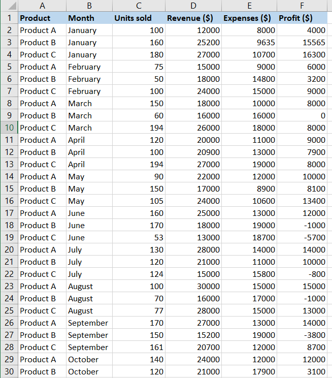
We’ll be using the data below to create our dashboard:
Here’s how to make a dashboard in Excel:
Step 1: Organize Your Data
The first step for creating an Excel dashboard is organizing your data. Tables and pivot tables are great ways to do this.
To convert your data into a table:
- Select the data.
- Go to “Insert” > “Table” in the Excel ribbon. You can also use the keyboard shortcut (Ctrl + T).
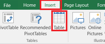
- Confirm the table range.
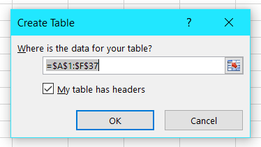
- Click “OK.”
Step 2: Filter the Data
Next, create pivot tables to help you summarize your data.
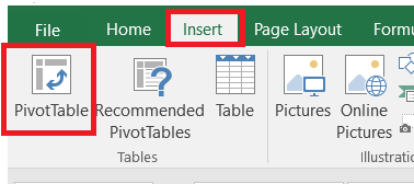
- Go to “Insert” > “Pivot Table.”
- Confirm the table range.
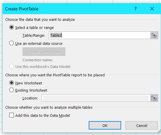
- Choose the option “New worksheet.”
- Click “OK.”
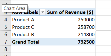
- Select the data you want to summarize in the new sheet by checking the columns you want to add.
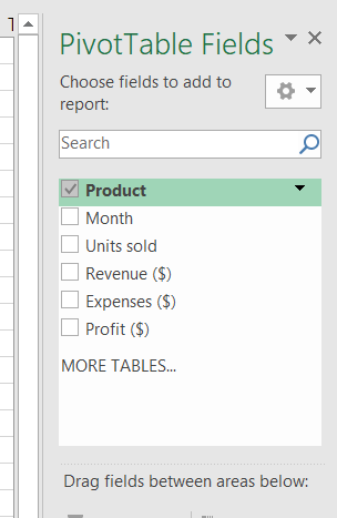
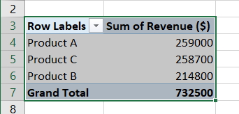
In our data, we selected the columns for product and revenue, creating the summarized table below:
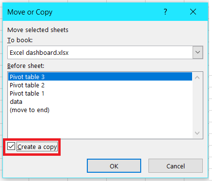
- Depending on your data, you can create as many pivot tables as you need. To make multiple pivot tables, it’s easiest to copy the original table (by right-clicking on the sheet tab) and choose “Move or Copy.”
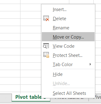
- Check the box for creating a copy and click “OK.”
- In our example, we’ve made four pivot tables. The pivot tables will help you to summarize your data and also help you handle basic calculations like sums, averages, and mins without formulas.
- If you need to make edits, be sure to change the data in each pivot table’s source sheet.
Step 3: Start Building the Excel Dashboard
Now we can start building the Excel dashboard. Some features to consider adding include Charts, Tables, Slicers, and Trendlines.
To begin building your dashboard:
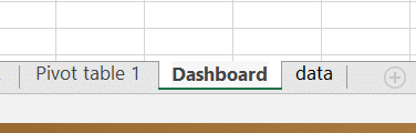
- Open a new sheet for the dashboard by clicking the plus (+) sign. Double-click on the sheet tab name and label it “Dashboard.”
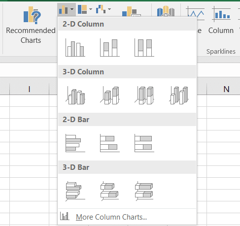
- Select the first pivot table.
- Go to “Insert” and select one of the charts provided by Excel.
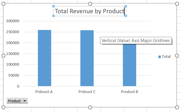
- Rename the chart.
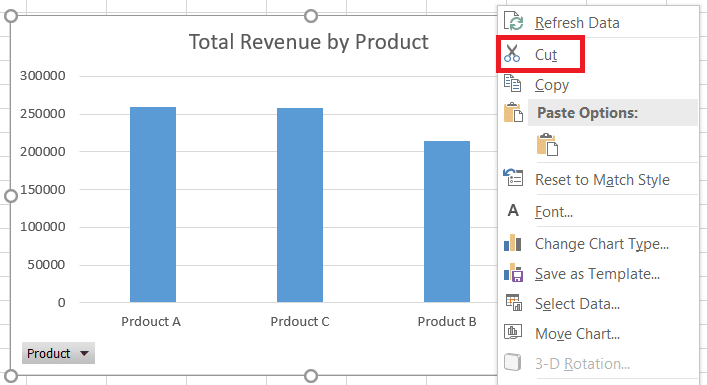
- Cut the chart and paste it into the newly created sheet for the dashboard.
- Repeat the process for all your charts.
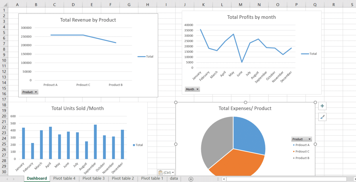
Step 4: Add Other Elements
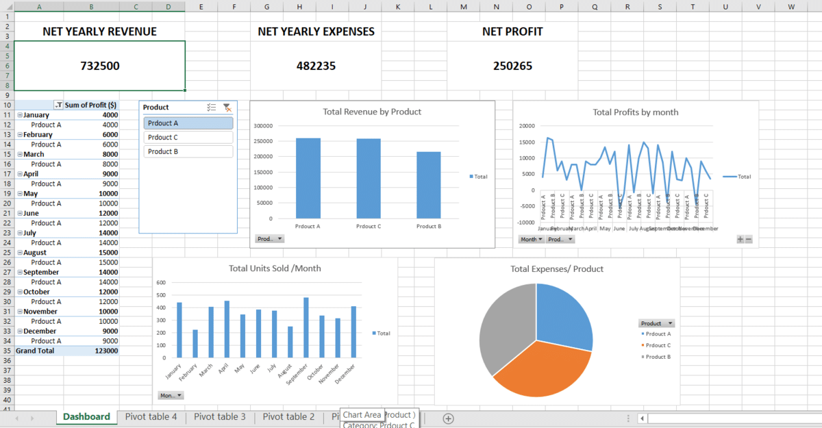
In addition to charts, you can also add multiple elements to your dashboard. In our example, we’ve added a pivot table under “Profits” with a slicer (to filter the profits by-product).
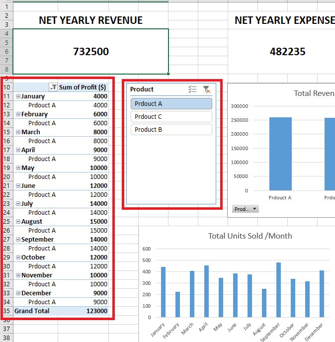
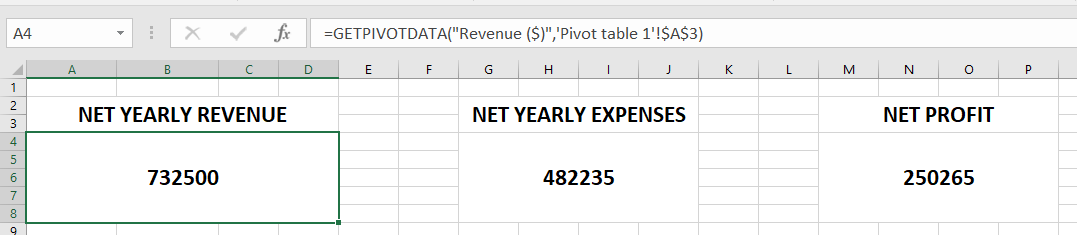
We’ve also added data for net revenue, profit, and expenses. Because this data is tied to the pivot tables, any changes made will be reflected in the data.
Make Dashboards Readable
You need to create a readable layout for your dashboard by deciding where every item should be. You might group specific statistics or some aspects so they sit next to one another. For example, you could keep a pivot table next to a relevant chart — or group all the pivot tables and charts together. Experiment and decide which layout works best for your needs.
Step 5: Formatting
Finally, we need to make the design of our dashboard consistent (e.g., color, font, spacing).
To format your Excel chart:
- Select the chart and click on the pen icon.
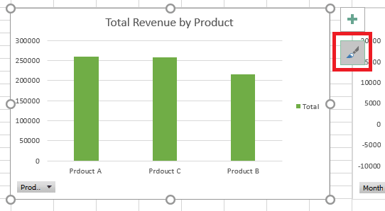
- In the “Style” tab, choose a suitable style.
- Go to the “Color” tab and choose the desired color scheme.
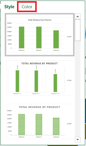
Note: You can do the same with other formatting options like cell background colors, borders, shapes, designs, and more.
Using Pre-Made Excel Dashboard Templates
Building a dashboard in Excel has never been easier. Below are some Excel dashboard templates that are designed to make your work lighter.
Simple Excel Dashboard Template
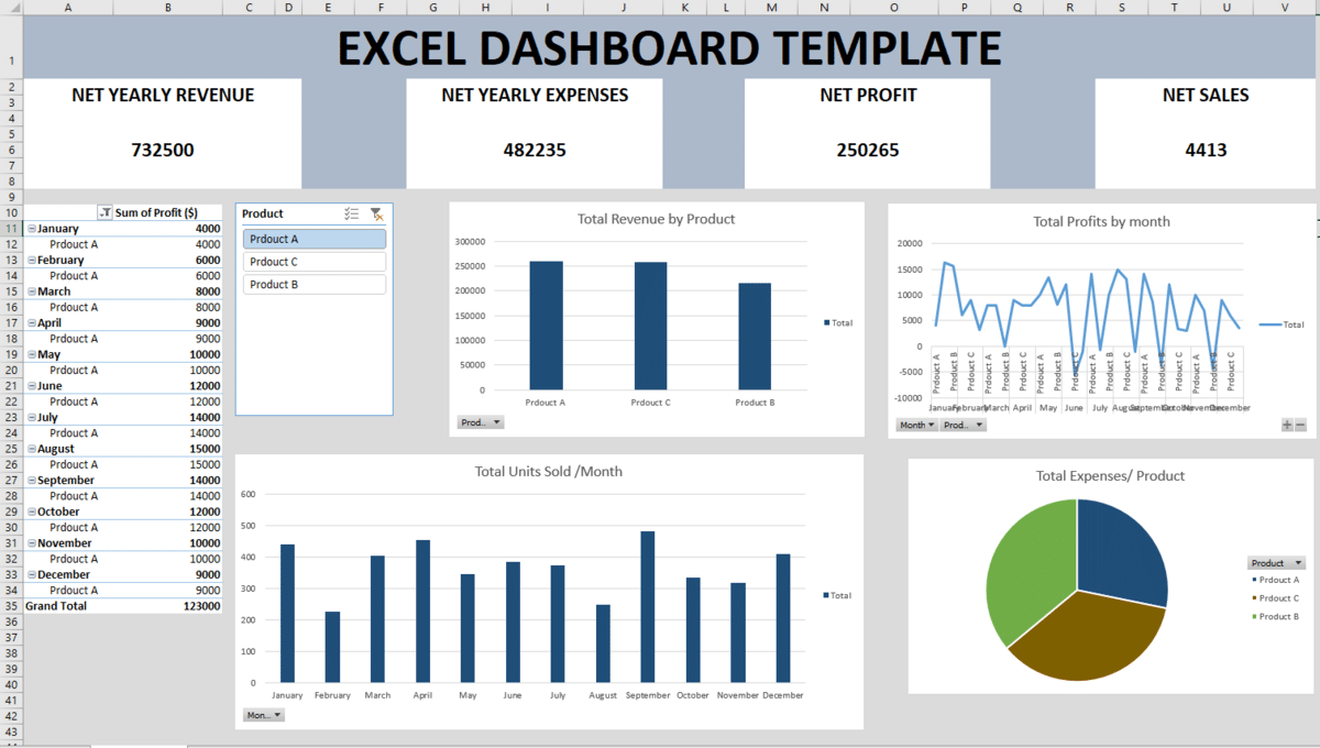
Our Excel dashboard template is a great way to get started. Its simple layout offers several charts and tables to represent data. The design follows a blue and gray color scheme that provides Excel dashboards with a cohesive, professional look.
Financial Excel Dashboard Template
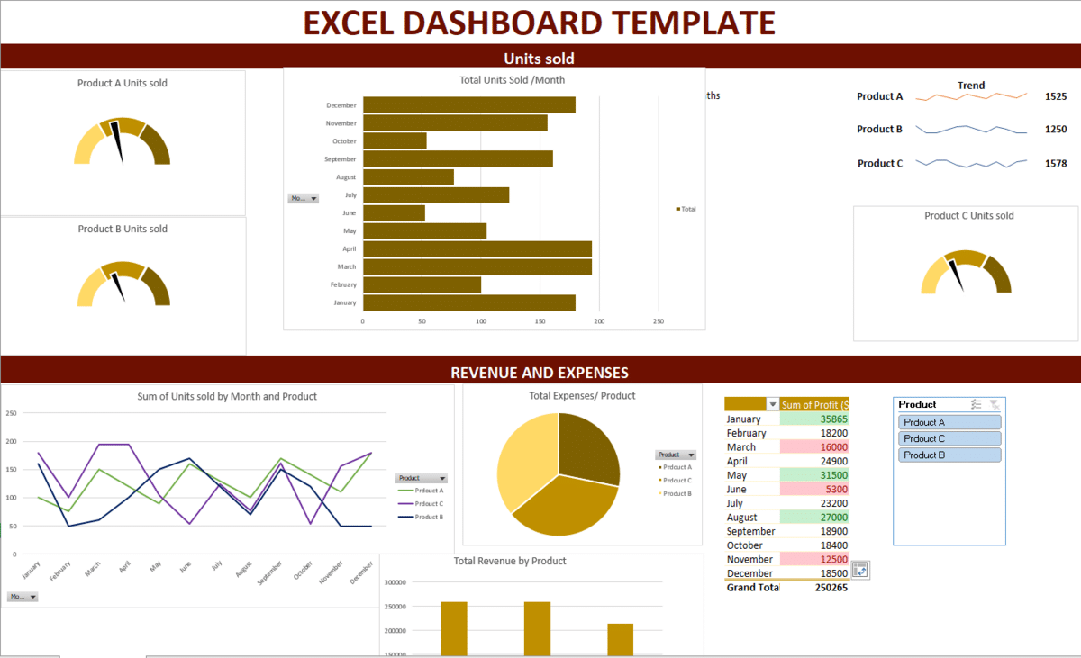
With its maroon and gold theme, this financial Excel dashboard template is unique and aesthetic. It is specifically designed to track and visualize the financial performance of a business over time.
You’ll find charts, tables, custom gauges, and trendlines for monitoring key financial metrics, identifying trends, and enabling better decision-making. Simply put, this customizable template allows you to create a sleek Excel dashboard.
Why Use Our Excel Dashboard Templates?
Our Excel dashboard templates offer several advantages that can streamline your data analysis, reporting, and decision-making processes.
- Our templates are pre-designed and ready to use.
- Excel dashboard templates are designed to present data cleanly and professionally for users of all experience levels.
- The designs include eye-catching charts, graphs, and tables that present data in a straightforward and exciting way.
- Excel dashboard templates combine essential information and KPIs into a single display, enabling users to monitor several indicators simultaneously.
- They’re highly customizable to meet users’ specific needs.
- They are designed to work with real-time data sources.
Best Practices for Creating Visually Effective Excel Dashboards
Creating visually compelling Excel dashboards involves following best practices that enhance the displayed data’s clarity, readability, and impact.
To create visually compelling and informative Excel dashboards:
- Define the purpose of your dashboard and identify the target audience. Focus on displaying the most relevant data that aligns with your audience’s needs and decision-making requirements.
- Avoid cluttering the dashboard with excessive data or visual elements.
- Stick to essential KPIs and limit the number of charts and graphs to maintain a clean and organized layout.
- Select appropriate chart types that effectively represent the data and highlight key insights. Bar, line, pie, and area charts are commonly used for data types.
- Minimize the use of 3D effects and unnecessary embellishments, as they can distort data visualization and make the dashboard appear cluttered.
- Double-check data accuracy used in the dashboard. Errors in the underlying data can lead to misleading insights.
- Ensure data labels and axis titles are clear, concise, and properly positioned. Avoid overcrowding labels, especially on small charts.
- If your dashboard contains multiple sheets or sections, provide intuitive navigation so users can quickly access the information they need.
- Create a responsive layout that adjusts well to different screen sizes and orientations. This is particularly important if you plan to share the dashboard with others.
- Include concise and relevant context (or explanations) to help users understand the data and the implications of the presented insights.
- Test the dashboard with a sample audience to gather feedback. Be sure to make improvements based on user suggestions and usability testing.
How Are Excel Dashboards Different Than Reports?
Excel dashboards and reports serve distinct purposes, differing in their presentation, structure, and usage. Here are the key differences between an Excel dashboard and a report:
1. Purpose
The main objective of an Excel dashboard is to present an understandable visual summary of essential data and key performance indicators (KPIs). Dashboards put a lot of emphasis on providing timely insights and empowering users to act on the data illustrated.
Conversely, reports are thorough publications that offer extensive analysis and granular information on a particular subject (or group of facts).
2. Visualization and Interactivity
Excel dashboards frequently use charts, graphs, and other graphical components to show data trends and patterns quickly. Since they’re interactive and can filter, sort, and study various data points, users may “drill down” into the data to examine more thoroughly.
Reports aim to convey data in a more organized and thorough manner and are typically less interactive. While they may contain graphs and charts, reports usually emphasize textual data and in-depth data analysis.
3. Data Scope
Dashboards present a limited set of essential KPIs and metrics that are relevant to a specific audience or business objective. They aim to provide a quick overview of performance without bombarding users with excessive details.
Reports encompass a broader scope of data, typically including extensive analyses, supporting evidence, and recommendations. Reports are comprehensive and can cover various aspects of a business or project in greater depth.
4. Real-Time Updates
Dashboards can be designed to display real-time data that allow users to monitor current performance metrics and track changes. This is done with the help of dynamic formulas and pivot tables.
Reports are typically static documents that reflect data at the time of creation. Although they can be updated periodically, reports don’t offer real-time data visualization.
5. Presentation Format
Dashboards are usually presented on a single screen or worksheet, focusing on visual elements and concise information. On the other hand, reports are presented as multi-page documents, allowing for detailed explanations, data tables, and comprehensive analyses.
6. Decision-Making and Analysis
Dashboards are designed for quick decision-making and provide an immediate performance overview. They are valuable for monitoring ongoing activities and identifying trends.
Reports are more suited for in-depth analysis, strategic planning, and sharing detailed insights with stakeholders. They are helpful in providing a thorough understanding of complex issues and facilitating long-term decision-making.
Related: Google Data Studio Tutorial
Frequently Asked Questions
How Frequently Does an Excel Dashboard Need to Be Updated?
The frequency at which an Excel dashboard needs to be updated depends on several factors, including the nature of the data displayed, the dashboard’s purpose, and a user’s needs. If the data in the dashboard relies on real-time (or near-real-time) data sources, the dashboard should be updated as often as the data changes.
Is Excel Dashboard Free?
Although most Excel Dashboards templates are for sale, you can find plenty of free Excel dashboard templates online — or even in this guide.
Bottom Line
This Excel dashboard tutorial has covered the key elements of using a template or designing your own dashboard. So now, you should have everything you need to make professional-level presentations. If you need a refresher, we’ve compiled a guide to the best Excel courses designed to take your skills to the next level.
Ready to jump right in with powerful premade spreadsheets? Check out our premium template library. When you use the code “SSP” at checkout, you’ll save 50%!
Related: